
12 Food Photography Tips for Restaurant Owners
As a restaurant owner, you pour your heart into every dish. You know the flavor is there, but getting photos that capture it is a constant headache. Hiring a professional photographer costs $75-150 per photo, takes weeks to schedule, and you wait days for the final images. Quality can vary from one shoot to the next, and re-shoots cost extra.
The good news: research shows food photos influence nearly two out of three people in their dining decisions, and the biggest improvements come from technique, not gear. This guide gives you 12 practical food photography tips built for restaurant owners. Whether you shoot with a smartphone or a DSLR, we cover the fundamentals that make a real difference: lighting, composition, styling, camera settings, and the final edit.
The phone in your pocket plus a window in your dining room can produce photos that make customers hungry the moment they see them. Here is how.
1. Use Natural Light as Your Main Light Source
If you only follow one tip, make it this one. Daylight beats every other light source for food. Soft, diffused window light shows the true colors and textures of your dishes, while a camera flash makes food look flat and greasy, and typical restaurant overhead lighting adds a dim yellow tint.
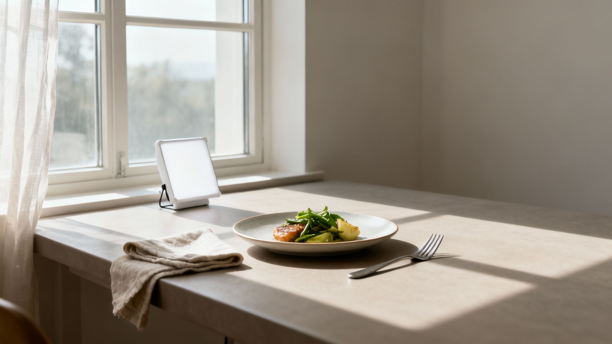
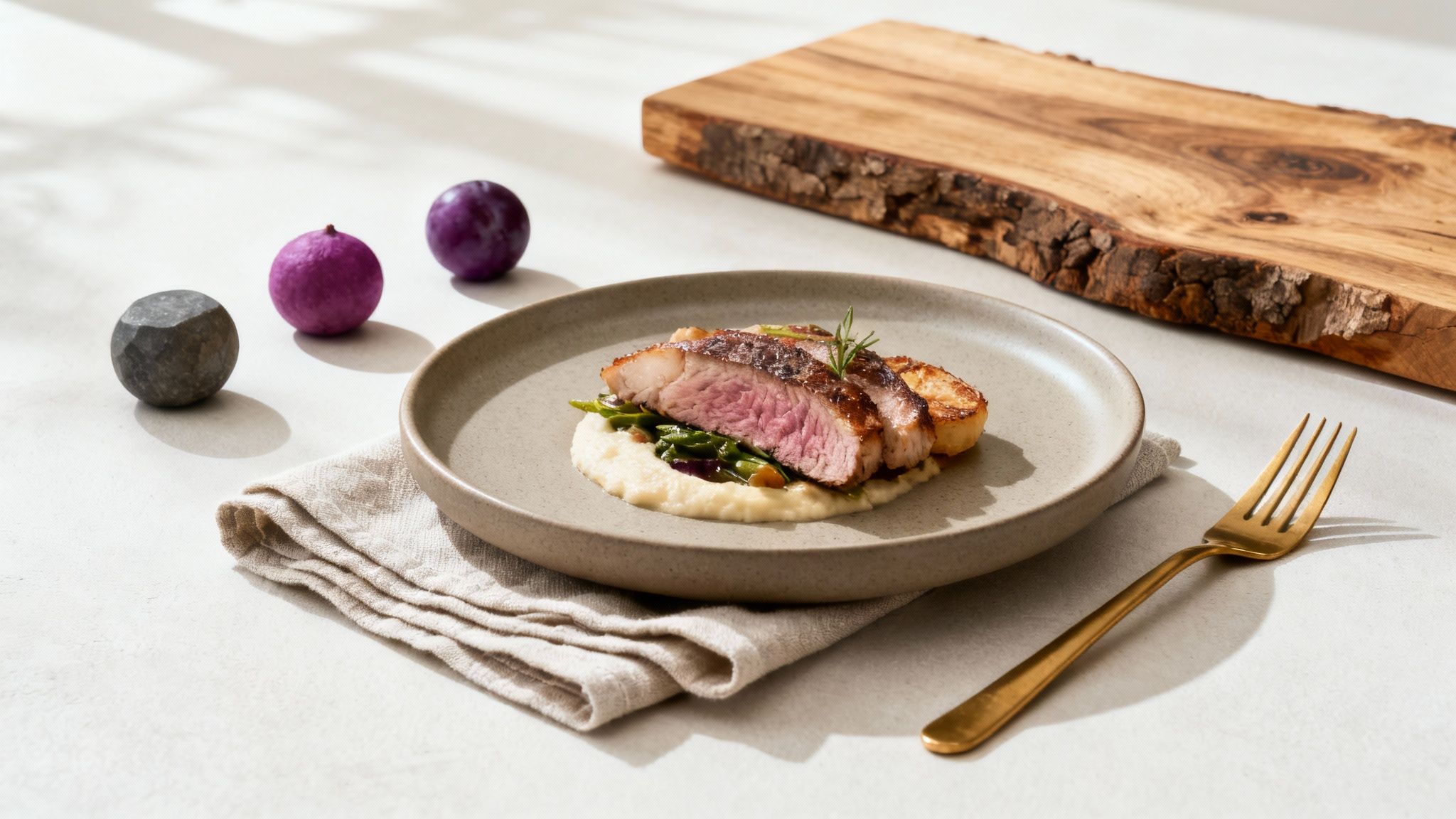
You do not need a studio. A table next to a window during off-hours is your whole setup. The single change of moving your plate to that table creates gentle shadows that give the dish dimension and depth. Top food bloggers and marketing teams rely on this exact setup because it consistently produces an inviting, genuine feel that connects with customers.
How to Use Natural Light Effectively
- Find the right window: A large window without direct, intense sun is ideal. North-facing windows give consistent, indirect light all day.
- Avoid direct sun: Harsh midday sunlight creates hard shadows and washes out detail. If the sun beams straight in, hang a thin white curtain or sheet over the window to diffuse it.
- Light from the side: Place the dish at a 45- to 90-degree angle to the window. Side lighting highlights texture and creates soft shadows that define the food's shape.
- Bounce the light: If the side of the dish away from the window looks too dark, prop up a white foam board, a napkin, or even a menu on the shadow side to reflect light back in.
- Time it well: The first few hours after sunrise and the last few before sunset give warm, gentle light. An overcast day works too: the clouds act as a giant natural diffuser.
- Never use flash: On-camera flash is the fastest way to make food look unappetizing. Stick to the window.
For a deeper dive into controlling and shaping light, see our full guide on food photography lighting.
2. Compose with the Rule of Thirds
How you arrange elements in the frame matters as much as the lighting. The rule of thirds is the simplest composition principle with the biggest payoff. Imagine your screen divided into a 3x3 grid. Instead of centering the dish, place it along one of the lines or at an intersection point.
Centered shots tend to look static, like quick snapshots. An off-center subject guides the viewer's eye through the image and makes the composition feel intentional. Publications like Bon Appetit and Food & Wine use off-center compositions constantly for exactly this reason.
How to Use the Rule of Thirds
- Enable your camera's grid: In your phone's camera settings, turn on "Grid" or "Gridlines" to overlay the 3x3 grid on your screen.
- Position the key element: Place the most important part of the dish, like the seared edge of a steak or a dollop of cream, on one of the four intersection points.
- Leave negative space: Empty areas around the dish are not wasted. They give the photo breathing room, prevent clutter, and pull the eye straight to the food.
- Use leading lines: A fork, a napkin edge, or a drizzle of sauce can form a line that draws the viewer toward the main dish.
3. Pick the Angle That Fits the Dish
The angle you shoot from completely changes how a dish is perceived. Shooting every item from the same perspective makes your menu look repetitive and hides each dish's best features. A tall burger and a flat pizza need different treatment.
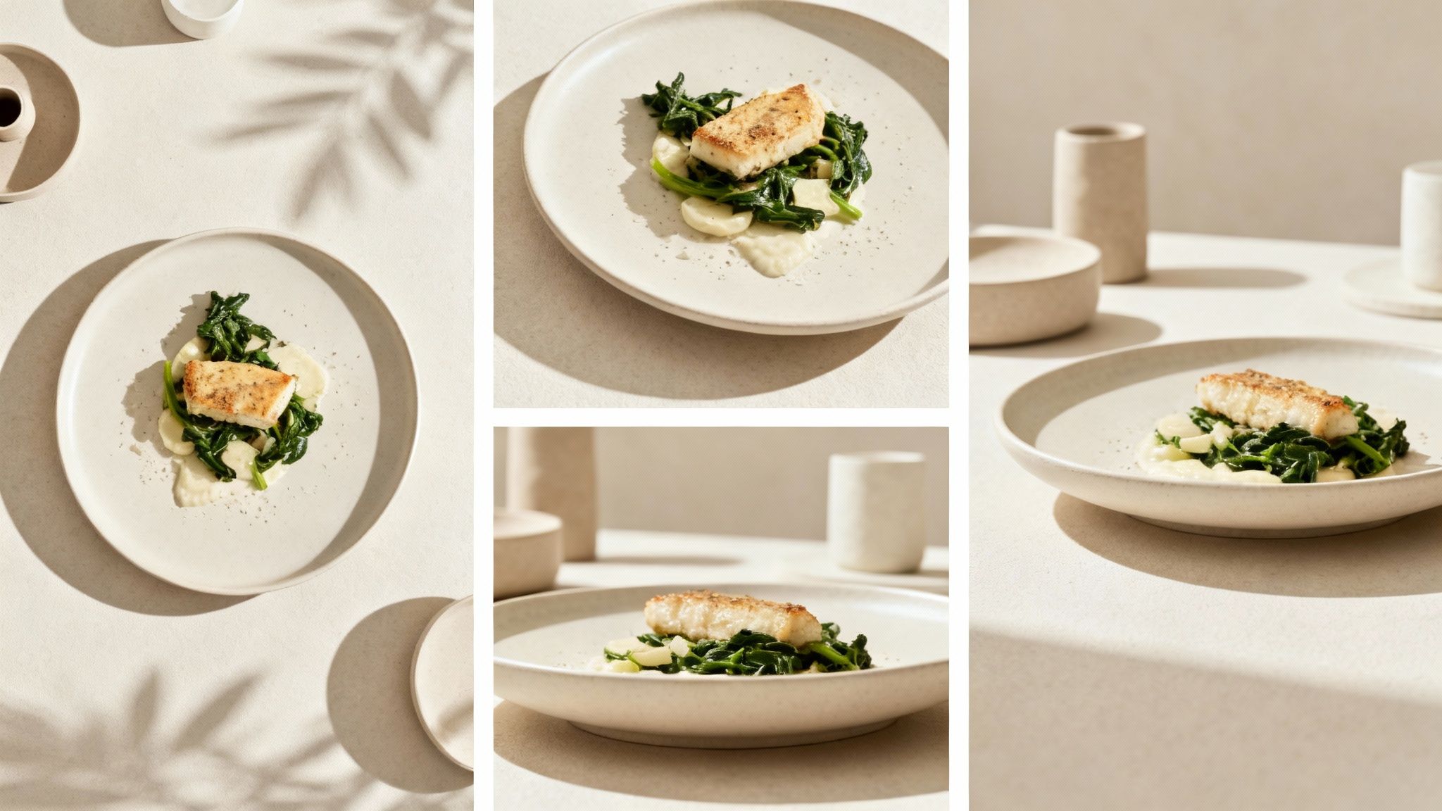
How to Choose the Right Angle
- 45-degree (the diner's view): Your default. This is how a customer sees the plate when seated, so it feels natural and shows both the top and side of the dish. Great for most plated food.
- Overhead, 90-degree (the flat lay): Shoot from directly above for pizzas, soups, salads, and charcuterie boards, where the arrangement on the surface is the star.
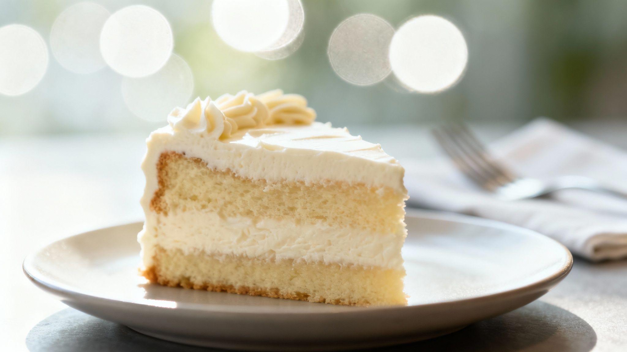
- Eye-level, 0-degree (the hero shot): Get low and shoot straight on to emphasize height and layers: burgers, pancake stacks, layered cakes, and drinks in tall glasses.
- Experiment between the classics: Try 30 or 75 degrees on the same dish and compare. A few extra shots cost nothing and often reveal the most flattering perspective.
For a visual walkthrough of how each angle changes the final image, this video gives a good overview:
4. Style the Plate with Simple Garnishing
Food styling is just arranging the dish and its surroundings on purpose. Food plated for eating does not always look its best on camera, and a few small, intentional tweaks fix that. This attention to detail signals quality and care, which directly influences a diner's decision to order.
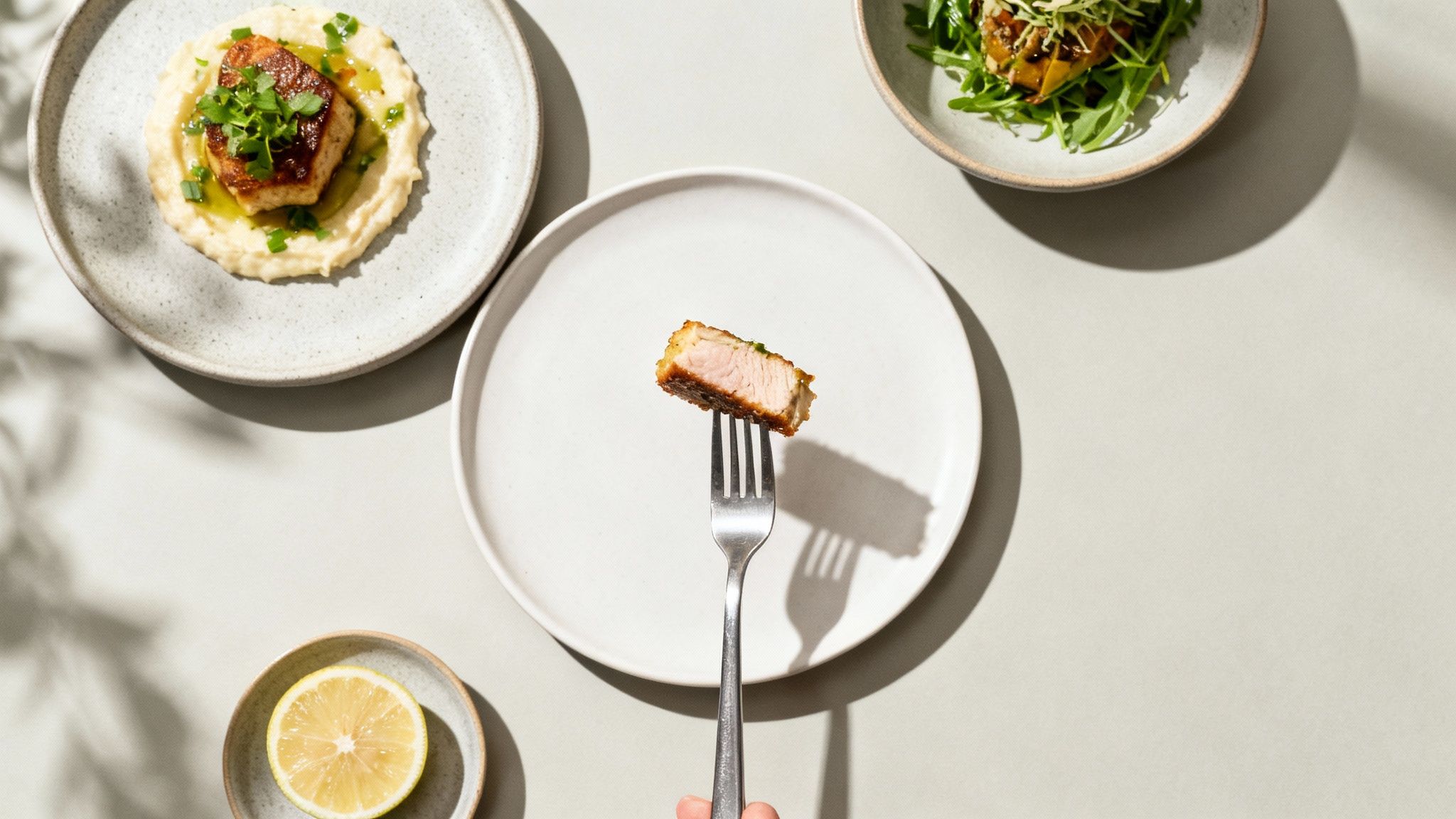
How to Style and Garnish Your Dishes
- Create height and layers: A flat plate reads as boring. Stack ingredients or prop key elements up slightly to add dimension.
- Use complementary garnishes: Pick garnishes that belong to the recipe: cilantro on tacos, basil on pasta, microgreens on a salad. They add color and signal freshness.
- Garnish at the last second: Add fresh herbs and sauce drips right before you shoot so they look vibrant, not wilted.
- Embrace odd numbers: When placing repeated elements like shrimp or meatballs, use three or five. Odd groupings look more natural to the eye than even ones.
- Add a touch of shine: A light brush of olive oil or water makes cooked meats and vegetables look glossy and freshly prepared.
- Scatter, don't arrange: Salt crystals, crumbs, or berries placed in a slightly random pattern feel authentic. Perfect symmetry looks staged.
- Keep the food dominant: A good guideline is roughly 60% of the frame for the food itself and 40% for props and background.
5. Use Color Theory to Make Dishes Pop
A dish gets lost when the plate or background is too close to its own color. Strategic color choices make the food the clear star and are one of the cheapest upgrades available: it costs nothing to swap a plate.
Two approaches work reliably. Complementary colors (opposites on the color wheel, like orange and blue) create high contrast and energy. Analogous colors (neighbors on the wheel, like a green salad on a rustic wooden board) produce a calmer, more cohesive look. Both beat random color pairings.
How to Use Color Effectively
- Pair complementary colors: Colors opposite each other on the color wheel create contrast and energy. Orange curry in a blue bowl, red berries with green mint, a green salad on a reddish-brown board.
- Lean on blue plateware: Almost no food is naturally blue, so blue plates make orange, yellow, and red dishes like curries and roasted chicken stand out sharply.
- Go neutral when the food is colorful: If the dish already has strong color, use white, gray, black, or wood backgrounds so the scene does not get busy.
- Limit the palette: Stick to two or three main colors per photo: a dominant color, a secondary, and an accent. More than that reads as chaotic.
- Use color psychology: Red tends to stimulate appetite and suits hearty dishes. Green suggests freshness for salads. Earth tones feel comforting for rustic food.
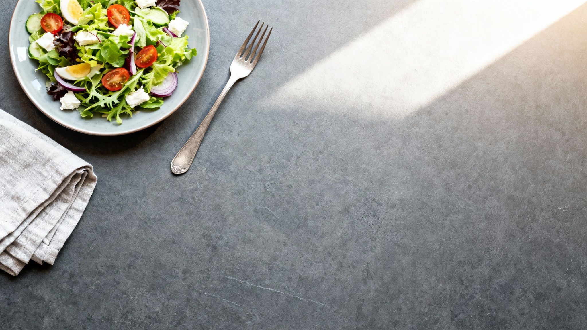
6. Choose Backgrounds and Props That Tell a Story
The plate, the table surface, and the fork beside the dish all work together to set a mood. A dish floating on a bare table can feel sterile, while a cluttered scene distracts. The right supporting cast matches your restaurant's brand, whether that is rustic and cozy or modern and clean.
Always test the pairing before you commit: place the dish on the background under your actual shooting light and check how the colors interact. A surface that looks great on its own can clash with the food or throw unwanted reflections.
How to Build Your Scene
- Start with neutral plates: Solid white, off-white, gray, or matte black plates act as a clean canvas. Loud patterns compete with the food.
- Build a small surface collection: 5-7 versatile backgrounds cover almost everything: a dark wood, a light wood, a stone or slate look, and a couple of neutral fabrics like linen. Home improvement stores sell single tiles of slate or concrete for a few dollars, and vinyl backdrops with wood or stone prints are cheap online.
- Keep props minimal and relevant: A linen napkin, a single fork, and a glass of water are often enough to suggest a dining experience. When in doubt, remove an item.
- Layer textures: A ceramic bowl on a linen napkin on a wooden table adds depth without adding clutter.
- Add a human element: Hands sprinkling cheese, sauce being poured, or fresh ingredients on a cutting board tell the story of how the meal is made and make the shot feel alive.
- Source smartly: Thrift stores, flea markets, and your own kitchen are full of props with character.
If sourcing physical backgrounds is a hassle, you can test different styles digitally with an AI food background generator.
7. Control Depth of Field to Guide the Eye
Depth of field is how much of the image is in focus. When everything is sharp, a cluttered background competes with the dish. A shallow depth of field, where the food is crisp and the background is a soft blur, isolates your subject and gives the photo a professional, three-dimensional look.
This video shows how focus and depth of field change the story a food photo tells:
How to Control Focus and Depth
- On a smartphone: Use Portrait Mode to simulate a blurred background, then tap the screen to set the focus point on the most appetizing part of the dish.
- On a DSLR or mirrorless: Use Aperture Priority mode (A or Av) with a wide aperture between f/2.0 and f/4.0 for a blurred background. Use f/5.6 to f/8 when you want the whole scene sharp, like a flat lay.
- Increase distance: Move the dish farther from the background. The more space behind the subject, the stronger the blur.
- Nail the focus point: Focus on the melted cheese, the glossy sauce drizzle, or the freshest garnish, not just the middle of the plate.
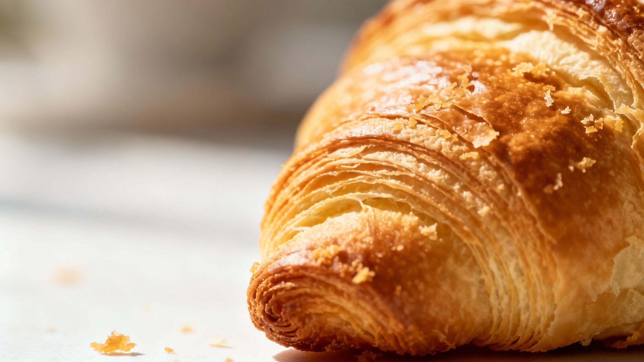
8. Get Close to Show Off Texture
Great food photos trigger a memory of taste and touch. The flaky layers of a croissant, the crispy skin on fried chicken, the char on a steak: these details are what make a viewer imagine the first bite, and they disappear when you shoot from too far away.
How to Capture Texture and Detail
- Fill the frame: Move in close, or crop in, on one specific detail like the crispy edge of fried chicken or the seeds on a strawberry. A phone's macro mode helps here.
- Use raking side light: Light hitting the food from a low side angle casts tiny shadows across the surface, which makes crumbs, grill marks, and crackle stand out.
- Capture action and moisture: Steam rising from a bowl, sauce mid-drizzle, or a cheese pull adds movement and signals the food is fresh and hot.
- Steady the camera: Close-up shots exaggerate hand shake. A small tripod keeps details sharp.
9. Dial In Camera Settings and White Balance
Automatic settings often produce blurry, dark, or oddly colored photos indoors. You do not need to become a technician, but a few manual adjustments give you consistent, accurate results every time.
Settings Worth Learning
- Adjust exposure manually: On a phone, tap the screen and slide the sun icon up or down to brighten or darken before you shoot.
- Lock your focus: Tap and hold on the key part of the dish until the lock icon appears so the camera stops hunting.
- Keep ISO low: ISO 100-400 gives clean, detailed images. High ISO adds grain.
- Use a fast shutter speed: At least 1/125s prevents blur from an unsteady hand.
- Fix your white balance: Different light sources have different color temperatures, which can turn food unnaturally blue or yellow. Indoor bulbs sit around 3000K and neutral daylight around 5500K; adjust your camera's Kelvin setting to match, or shoot a test frame with an 18% gray card and correct against it in editing.
- Shoot in RAW if you can: Many newer phones and all dedicated cameras support RAW. The file keeps far more data, so you can fix exposure and color in editing without losing quality.
10. Choose the Right Equipment (It Might Be Your Phone)
Many owners assume they need an expensive camera for professional results. High-end gear is costly and has a learning curve, and for online menus and social media, a modern smartphone paired with good light and composition is usually enough. The main advantage of a DSLR or mirrorless camera is finer control over aperture and lenses.
How to Spend (or Not Spend) on Gear
- Start with your smartphone: Master lighting and composition with the tool you already own before buying anything.
- Buy a tripod first: Before upgrading your camera, get a sturdy tripod. It eliminates shake, keeps framing consistent across dishes, and frees your hands for styling.
- If you buy a lens, start with a 50mm prime: The "nifty fifty" is affordable, versatile, and produces natural-looking shots on a DSLR.
- Prioritize glass over body: A good lens on an entry-level camera beats a cheap lens on an expensive body almost every time.
For a full breakdown, see our guide on equipment for food photography.
11. Edit Your Photos for a Consistent Look
Shooting is only half the work. Unedited photos can look flat, and images from the same shoot often vary in color and brightness. Editing is not about making food look fake; it is about making it look the way it did in person, and making every photo on your menu share one recognizable style.
Think of food publications with a signature look: that consistency comes from editing, not from the camera. When customers scroll past your photos, a uniform style builds recognition and trust, and it makes the whole menu look professional rather than assembled from different shoots.
How to Edit for Consistency
- Correct white balance first: Get whites truly white so every other color falls into place, then adjust overall exposure.
- Prefer vibrance over saturation: Vibrance boosts the duller colors without pushing already-strong ones into cartoon territory. Maxed-out saturation is the most common tell of an amateur edit.
- Adjust colors selectively: Boost the reds in a tomato sauce or the oranges in a curry rather than shifting the whole image.
- Sharpen selectively: Sharpen the pastry crust or the grill marks, not the entire frame.
- Save a preset: Once you find a look you like in a tool like Lightroom or Snapseed, save it and apply it to every photo. Batch-editing with one preset is the fastest route to a cohesive menu.
For a faster route, see how restaurant owners edit menu photos with AI text commands.
12. Adapt Your Photos for Each Platform
A single photo rarely works everywhere your customers see it. Vertical content fills the screen on TikTok and Instagram Reels, the Instagram feed still favors squares, and your website banner probably needs a wide landscape crop. Thinking about the destination before you shoot saves painful cropping later.
For product-style shots headed to your website or delivery apps, our guide on how to take better product photos covers the format details.
How to Optimize for Different Platforms
- Shoot vertical for Stories and Reels: Portrait orientation fills the whole mobile screen on TikTok and Instagram Reels.
- Frame for the square: Compose so the main subject still looks right in a 1:1 crop for the Instagram feed.
- Capture a few wide shots: Websites and email headers usually need horizontal images. Grab them while the dish is styled.
- Check current size specs: A quick search for the platform's image size guide tells you the resolution that avoids ugly compression.
Quick Reference: The 12 Tips at a Glance
| Tip | Effort to learn | What you need | Biggest payoff |
|---|---|---|---|
| 1. Natural window light | Low | A window, white foam board | Soft, true-to-life color and texture |
| 2. Rule of thirds | Low | Camera grid turned on | Balanced, deliberate compositions |
| 3. Angle matched to the dish | Low | Willingness to move around the plate | Every dish shows its best feature |
| 4. Styling and garnish | Medium | Fresh garnishes, small tweaks at plating | Food looks cared for and fresh |
| 5. Color theory | Medium | A few plates in contrasting colors | Dishes pop instead of blending in |
| 6. Backgrounds and props | Medium | 5-7 surfaces, a napkin, a fork | Photos that match your brand's story |
| 7. Depth of field | Low-Medium | Portrait Mode or f/2.0-f/4.0 | The eye lands on the food, not the clutter |
| 8. Texture close-ups | Medium | Macro mode, side light, tripod | Shots that make viewers imagine the bite |
| 9. Camera settings | Medium | Manual exposure, ISO 100-400, RAW | Sharp, accurate, repeatable results |
| 10. Right-sized equipment | Low | Your phone plus a tripod | Pro-looking photos without pro spending |
| 11. Consistent editing | Medium | One saved preset, applied everywhere | A menu that looks like one brand |
| 12. Platform-ready formats | Low | Vertical, square, and wide versions | No ugly crops or compression anywhere |
A Faster Way to Perfect Your Menu Photos
The twelve tips above will get you a genuinely good photo. The last hurdle for most restaurant owners is the edit: learning software like Photoshop is another job on its own, and hiring out editing brings back the $75-150 per photo problem with a 2-7 day turnaround.
This is why we built MenuCapture. Most AI photo tools generate fake food images from scratch, which does not help when you need a picture of your pizza, not a generic one. MenuCapture edits the actual photos you take.
How It Works: Edit Photos by Typing
Take a photo with your phone using the tips above, upload it, and type what you want changed. The AI analyzes the lighting, color, and composition and applies your edit in 10-30 seconds.
You can type instructions like:
- "Add melted cheese on top"
- "Make the sauce more glossy"
- "Change lighting to warmer"
- "Add steam rising from the soup"
- "Swap the chicken for tofu"
If the first result is not right, keep editing: every version is saved with thumbnails, so you can undo any change or jump back to an earlier edit. Images land in an organized gallery grouped by date and searchable. You can also change backgrounds ("place dish on a concrete table") and process up to 10 photos at once when you roll out a new menu. You can read more about AI food photography for restaurants.
These are not just tools for fixing mistakes. You can visually test menu ideas or create tailored images for a seasonal promotion without cooking an extra plate.
The Cost and Time Comparison
Traditional photography:
- $75-150 per photo
- 2-7 day turnaround
- Photographer scheduling required
- Re-shoots cost extra
MenuCapture AI processing:
- $0.09 per photo on the $159/year plan, or about $0.24 on the $9/week plan
- 10-30 second processing
- Works instantly with your smartphone photos
- Edit the same image as many times as you need
That is a 99.9% saving on menu photo costs, with results in seconds instead of days. These food photography tips give you the foundation; MenuCapture handles the finishing.
Frequently Asked Questions
You are a chef or a restaurant owner, not a photographer, and stepping into food photography raises the same questions for almost everyone. Here are the answers to the ones we hear most often.
Do I really need a fancy camera for food photography?
No, and this is the biggest myth in the field. A well-lit, well-composed shot from a current iPhone or Android will beat a dark, sloppy photo from a high-end camera every time. The results come from fundamentals: soft window light, a deliberate angle, and a clean composition. Upgrade to a dedicated camera only when you hit the limits of your phone, and buy a tripod before you buy anything else.
Will using AI make my food look fake?
It depends on the tool. AI image generators that create dishes from scratch often produce an artificial look. MenuCapture works differently: it edits the photo you took of your actual food, keeping the real textures and colors of your ingredients. You stay in control the whole time. If an edit goes too far, type a follow-up like "tone down the glossiness a little" or hit undo in the version history.
How much time does this actually take?
Less than you would expect. Once your window-side setup is ready, shooting takes a few minutes per dish. Editing in MenuCapture takes 10-30 seconds per photo. Realistically, you can shoot and finish photos for an entire menu in one afternoon instead of waiting days or weeks for a traditional photographer's turnaround.
Should I shoot from above or from the side?
Match the angle to the dish's best feature. Overhead shots suit "flat" foods like pizza, soup, and charcuterie boards, where the arrangement is the appeal. Side and 45-degree shots suit "tall" foods: they show off the height of a burger, the layers in a pancake stack, or the cross-section of a cake. When in doubt, take a few shots from different angles and pick the one that makes the dish look most tempting.
Ready to take control of your menu's visuals without the high costs and long waits? Process your menu photos with AI and see the results with your own food.
Upload restaurant photos at MenuCapture.
Ready to transform your menu photos?
Type what you want changed and AI processes your restaurant photos in seconds.
Start Processing Photos